
Redesigning Bandel Automobiltechnik’s Website with UX/UI, Usability testing and wireframin
Project Overview
This fictional case study explores the redesign of the Bandel Automobiltechnik GmbH website, focusing on enhancing the usability of its product search and checkout experience. The project was carried out as part of a UX/UI training program and aimed to simulate a real-world product optimization scenario for an automotive e-commerce platform.
Through a combination of usability testing, customer journey mapping, and structured problem analysis (SCR), the project identified key friction points in the user experience. Based on these insights, low-fidelity wireframes were developed to demonstrate how the website could be restructured to improve navigation, clarity, and overall user satisfaction.
The outcome is a user-centered redesign concept that addresses critical UX issues and showcases the application of research-driven design methods in a B2C e-commerce context.
Usability Test Planning
Before conducting the usability test, a clear objective and test structure were defined to ensure meaningful and actionable insights.
Test Objective
The goal was to evaluate the usability of Bandel’s product search and filtering process, identify common friction points, and assess how effectively users can navigate the site and complete a typical purchase scenario.
User Scenario
A realistic shopping flow was designed to reflect the core user experience:
Open the Bandel website.
Search for “brake pads Honda Civic.”
Apply filters by price and manufacturer.
Select a product and add it to the cart.
Proceed to checkout until the payment information step (without completing the purchase).
Test Questions (Interview Guide)
Participants were asked a series of structured questions to gather qualitative feedback:
How easy was it to find and use the search function?
Were the search results understandable and relevant?
Did you face any difficulties using the filter options?
Were product details helpful in making a decision?
Was the cart experience intuitive?
How did you feel about the checkout process?
Which parts of the site were confusing or frustrating?
Participant Selection
The test was conducted with a real user who matched the target persona: a private vehicle owner searching for auto parts online. The session was observed and documented to capture behavioral patterns and usability breakdowns.
Session Documentation
The entire usability test session was recorded on video to ensure accuracy in capturing user behavior, comments, and reactions. This allowed for a more detailed post-analysis of interaction patterns, usability issues, and emotional responses during the test.
Key moments from the recording were used to validate findings, prioritize usability problems, and support the redesign decisions made in the wireframing phase.
Research Summary
The UX analysis of Bandel-online.de focused on identifying key usability problems and proposing practical improvements for the platform’s desktop experience. The research combined observational testing, structured frameworks, and wireframing to guide a potential redesign.
Context and Problem
Bandel-online.de offers a wide selection of car parts but suffers from an outdated interface and poor usability. Despite its strong product offering, the platform presents barriers to effective navigation, search, and checkout—especially for first-time or less tech-savvy users.
Methods Used
Customer Journey Mapping (CJM): Used to identify emotional highs and lows along the user path, and to locate friction points in real-world scenarios.
Usability Testing: Conducted with a real participant to observe live behavior during product search and checkout.
SCR Framework (Situation–Complication–Resolution): Used to structure key findings and link them to actionable design proposals.
Wireframing: Low-fidelity wireframes translated the insights into practical layout and UX/UI improvements.
Key Insights
The navigation lacked clarity and logical hierarchy.
Search and filtering functions were inefficient and confusing.
The visual layout felt outdated and overwhelmed users with text.
Important features such as vehicle selection and checkout lacked proper feedback or guidance.
Beginners especially struggled with confidence due to missing visual confirmations and intuitive onboarding.
Conclusion
The findings confirmed that small, targeted adjustments—such as clearer navigation, simplified filtering, visual feedback, and separation of complex input options—can significantly improve the overall user experience. The research supports a step-by-step redesign strategy with measurable impact on customer satisfaction and conversion rates.
Findings & Key Issues
The usability test, combined with observational data and customer journey mapping, revealed several key usability challenges that disrupted the overall user experience. These findings were prioritized based on their frequency, severity, and impact on completing core tasks.
1. Search and Filtering Issues
Users struggled to refine product searches effectively due to unclear filter options and information overload.
The filter UI lacked visual hierarchy, making it difficult to navigate and understand what was applied.
Confusion during the discovery phase was reflected in the CJM as users expressed uncertainty like “Verwirrung bei der Suche” and “Unklarheit über das Produktangebot.”
2. Inefficient Product and Cart Interaction
Product information lacked structure, resulting in difficulty comparing and selecting items.
Users encountered problems when interacting with the cart: “Warenkorb-Bedienung ist unklar” was a repeated issue.
The journey step Use showed emotional neutrality, indicating a missed opportunity to create satisfaction.
3. Lack of Guidance and Emotional Drop-Off
After completing a purchase, users received a standard confirmation and newsletter, which led to disengagement rather than retention: “Die Seite hat mich nicht überzeugt.”
In the Retention stage, the emotional tone dropped to disappointment.
Despite recommending the site to others (“Ich empfehle die Seite meinem Freund”), users stated they “didn’t think much of it,” indicating low brand loyalty.
Mapped in the Customer Journey
All insights were synthesized into a Customer Journey Map, which visualized the experience of a typical user (Moussa, a 21-year-old car mechanic apprentice). The map clearly highlighted friction points and emotional shifts across the five key phases: Awareness, Discovery, Use, Retention, and Advocacy.
This helped not only in identifying usability problems but also in understanding when and why users felt lost, disappointed, or disconnected—and how that influenced their decision to continue using (or recommending) the product.
Design Recommendations & Wireframes
To address the usability issues identified through testing and research, a set of low-fidelity wireframes was developed. These visual drafts aim to simplify navigation, reduce user friction, and support task completion throughout the user journey.
1. Improved Navigation Structure
The original navigation was cluttered and lacked visual hierarchy. The proposed redesign highlights main product categories using visual tiles and organizes subcategories in a dropdown menu. This approach allows users to quickly recognize relevant sections and supports intuitive browsing.
Before

After
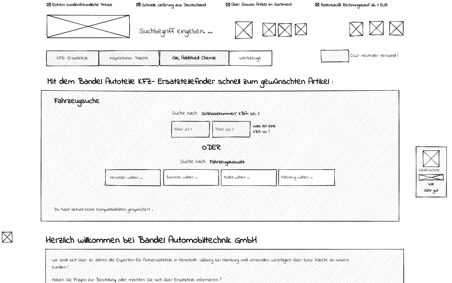
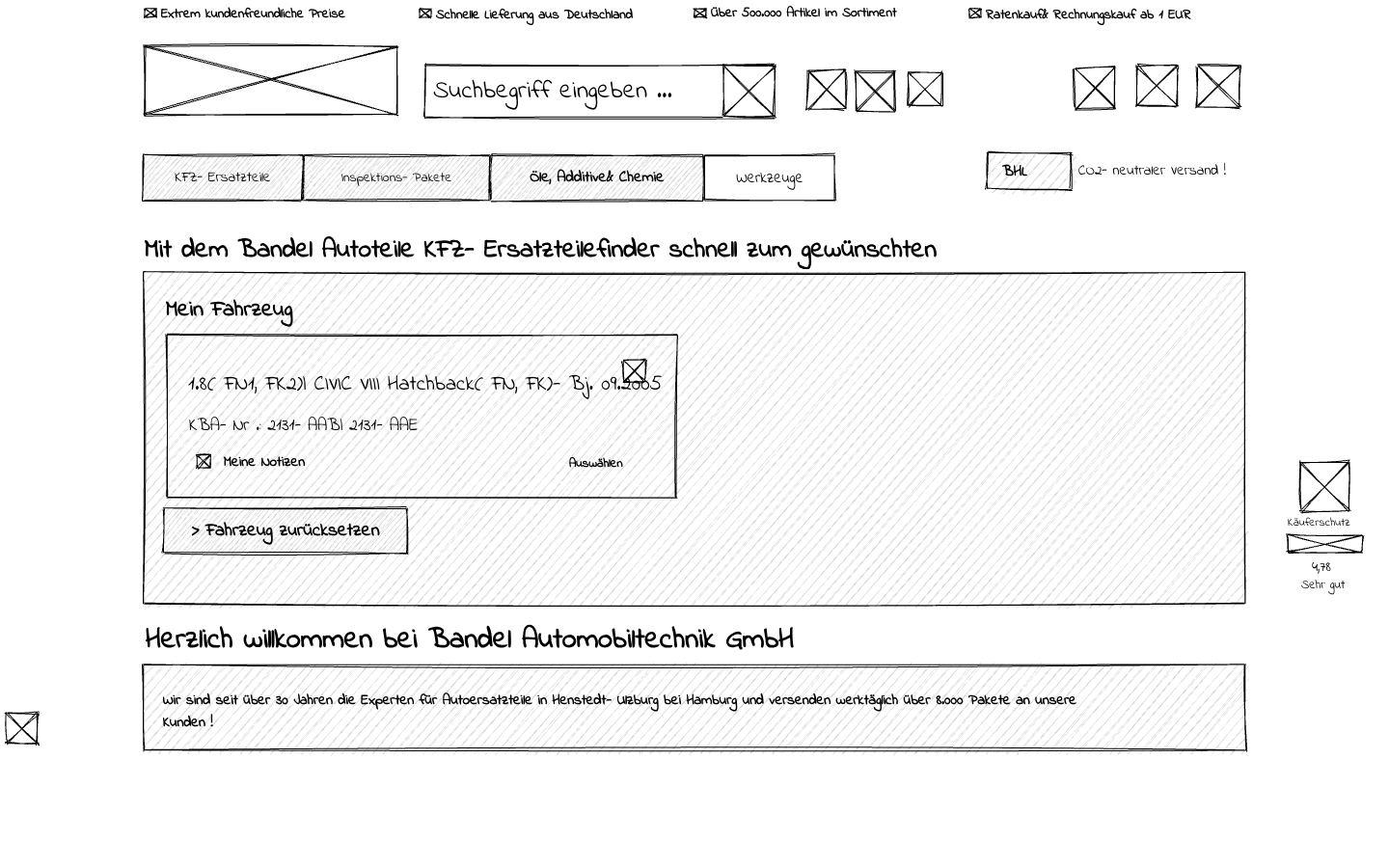
2. Simplified Vehicle Entry (KFZ-Eingabe)
The current vehicle selection combines multiple entry methods in one block, leading to confusion. The proposed solution separates the KBA number input from manual entry and adds a clear “OR” label to reduce cognitive load.
Before
After
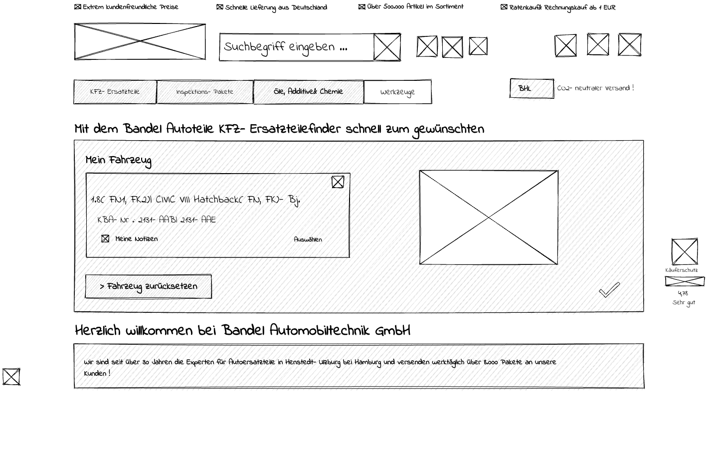
3. Visual Confirmation for Beginners
First-time users often lacked confidence in their vehicle selection. The redesigned version includes a vehicle image preview and confirmation icons (checkmark or cross) next to the input, enhancing trust and minimizing input errors.
Before
After
4. Optimized Cart and Checkout Process
The shopping cart previously required page reloads and lacked clear CTAs. The redesign introduces a persistent cart sidebar with a “Buy Now” button, minimizing steps and encouraging faster checkout—standard in modern e-commerce UX design
Conclusion & Learnings
This project highlighted the importance of user-centered thinking in optimizing digital product experiences. By combining usability testing, customer journey mapping, and low-fidelity prototyping, it was possible to uncover and address critical usability barriers on Bandel-online.de.
The findings made it clear: small changes in UX and UI can have a significant impact. Even seemingly simple adjustments—like clearer input fields, visual confirmation, or restructured navigation—can increase user confidence, reduce friction, and directly influence conversion rates.
What Comes Next
If this were a real-world implementation, the logical next step would involve:
Developing high-fidelity prototypes based on the validated wireframes
Running A/B tests to compare the redesigned experience against the original version
Iterating based on live performance data, user feedback, and behavioral insights
Monitoring KPIs such as bounce rate, task completion time, cart abandonment, and NPS (Net Promoter Score)
Personal Reflection
This case study deepened my understanding of how structured UX research leads to design decisions grounded in real user needs. It also emphasized the value of iterative design and measurable improvements—a mindset I’ll carry into future product work.